
Web design trends change quickly, but most of them are not worth rebuilding a website around.
Some disappear within a year. Others reflect larger changes in how people use websites, how brands compete for attention and what modern browsers and development tools make possible.
Heading into 2027, the strongest direction is not one particular visual style.
Websites are becoming more distinctive, more interactive and more technically capable, while good design is becoming less tolerant of unnecessary complexity.
The best trends are not decoration. They improve how a website communicates, feels and works.
Here are the ones we think actually matter.
1. Websites are becoming less interchangeable
For years, a large part of the web moved toward the same visual formula.
Large headline. Short paragraph. Rounded cards. Gradient background. Product screenshot. Three-column feature grid.
It works, but when every company uses the same structure, good design starts to become invisible.
More brands are now building recognizable visual systems instead of simply following whatever style is currently popular.
That can include:
- custom typography
- distinctive layouts
- illustration systems
- unusual image treatments
- custom iconography
- branded motion
- interactive details
- consistent visual rules that carry across the entire site
The important part is not making a website unusual for the sake of it.
It is making it recognizably yours.
As design tools and AI make polished layouts easier to produce, originality becomes more valuable, not less.
2. Less copy, better copy
Websites do not need to explain everything immediately.
One of the better shifts in modern web design is toward shorter, more deliberate copy.
That does not mean removing useful information.
It means separating what needs to be understood immediately from what can be explained later.
A strong hero section may only need:
- a clear headline
- one useful supporting sentence
- one primary action
The rest of the page can provide detail as the visitor moves through it.
This works especially well when the visual design already communicates part of the story.
Short copy is not automatically good copy, though.
If removing words makes the offer vague, the website has gone too far.
Clarity still matters more than minimalism.
3. Motion is becoming part of the interface
Animation used to be treated mostly as decoration.
That is changing.
Good motion can now help explain hierarchy, show relationships between elements and guide attention through a page.
Useful examples include:
- section transitions
- responsive hover states
- menu animations
- content reveals
- scroll progress
- product demonstrations
- interactive diagrams
- transitions between interface states
The best motion usually feels obvious only after it is removed.
It supports the interface rather than demanding attention from it.
A website does not need animation everywhere.
Too much motion can make a site slower, harder to use and more tiring to navigate.
It should also respect the user’s prefers-reduced-motion setting.
The goal is not to make every section move.
The goal is to use movement where it improves the experience.
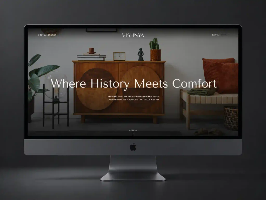
4. Scroll is becoming an interaction, not just navigation
Scrolling is one of the few interactions almost every website visitor already understands.
Modern websites are using it more intentionally.
Instead of treating the page as a stack of static sections, scrolling can:
- reveal information progressively
- move through a sequence
- control visual transformations
- show progress
- compare before and after states
- introduce products or projects step by step
This works particularly well for portfolios, product websites and pages that need to explain something visually.
It also comes with a warning.
Scroll effects should never make basic information difficult to access.
If someone has to complete an elaborate animation sequence just to read a paragraph or click a button, the interaction is working against the website.
5. AI will influence web design without needing to look like AI
AI is already changing how websites are planned, designed and developed.
That does not mean websites need glowing robot graphics, generated gradients or a chatbot in the corner.
The more important change is happening behind the interface.
AI can help with:
- early layout exploration
- image generation and editing
- code generation
- content organization
- repetitive development tasks
- testing variations
- data analysis
- personalization
- maintaining larger websites
The result should still feel intentionally designed.
As AI-generated layouts become easier to create, generic design will become even easier to recognize.
The advantage will belong to teams that use AI to speed up repetitive work while keeping human judgment in control of the final product.
6. Human details matter more in an AI-heavy web
The easier it becomes to generate technically polished content, the more valuable real details become.
This applies to both design and content.
Real photography, recognizable people, actual projects, specific writing and imperfect human details can make a website feel more credible than another collection of polished stock assets.
That does not mean every company needs candid office photography or hand-drawn illustrations.
It means the website should contain evidence that a real business exists behind it.
For service businesses, this may include:
- team photography
- actual client work
- project screenshots
- real locations
- behind-the-scenes images
- specific processes
- original diagrams
- real client feedback
Authenticity is becoming a design advantage.
7. Accessibility is becoming part of normal web design
Accessibility should not be treated as a separate layer added after the website is finished.
Modern design decisions need to account for it from the beginning.
That includes:
- readable contrast
- visible keyboard focus
- usable target sizes
- semantic structure
- properly labeled controls
- accessible forms
- alternative text for meaningful images
- keyboard navigation
- reduced-motion support
- content that remains understandable when zoomed
WCAG 2.2 is the current W3C accessibility standard and adds requirements around areas such as focus visibility, dragging movements and minimum target size.
Many accessibility improvements also make websites easier for everyone to use.
A button that is easier to tap helps more than one type of visitor.
A form with clear labels is better for everyone.
Good accessibility and good usability overlap more often than they conflict.
8. Performance is becoming a design constraint
A website can look impressive in a design file and still become a bad website once it is built.
Modern web design has to account for performance earlier.
Large videos, oversized images, complex animation, third-party scripts and heavy JavaScript all have a cost.
That does not mean modern websites need to look basic.
It means design and development need to make decisions together.
For example:
- use video when it adds something meaningful
- optimize images before they reach production
- avoid loading animation libraries for one small effect
- lazy-load content that does not need to appear immediately
- keep the first screen lightweight
- test the real website, not just the prototype
Performance is part of the user experience.
Visitors do not care how impressive an animation would have looked if they leave before it loads.
9. Responsive design is becoming more fluid
Designing three fixed versions of a website for desktop, tablet and mobile is increasingly limiting.
Modern layouts can respond more fluidly to the available space.
CSS features such as container queries, flexible grids, clamp() and improved viewport units make it easier to build interfaces that adapt between traditional breakpoints.
This leads to layouts that behave better across:
- small phones
- large phones
- tablets
- laptops
- large desktop monitors
- embedded browser windows
- unusual aspect ratios
The goal is not to eliminate breakpoints.
It is to stop treating every screen between two breakpoints as an afterthought.
A responsive website should feel designed at different sizes, not simply compressed.
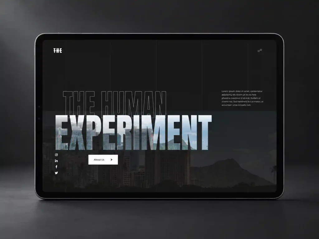
10. Typography is doing more of the visual work
Large typography is not new.
What is changing is how much responsibility typography carries in the overall design.
Strong type can replace decorative elements that previously required images, shapes or effects.
Modern sites are using typography for:
- hierarchy
- brand personality
- visual rhythm
- navigation
- animation
- contrast between sections
Variable fonts also give designers more control over weight, width and other characteristics without requiring a large collection of separate font files.
The important part is still readability.
An interesting typeface is not useful if the body copy becomes difficult to read.
Typography should add personality without turning basic communication into a design exercise.
11. Asymmetry is replacing some rigid grid layouts
Perfectly aligned cards and symmetrical sections are not disappearing.
They are simply no longer the only safe option.
More websites are using:
- overlapping content
- offset columns
- irregular spacing
- intentionally unbalanced compositions
- editorial-style layouts
- elements that break outside the main grid
Used well, this can give a website more energy and personality.
Used badly, it looks like the layout is broken.
The underlying grid still matters.
Good asymmetry usually works because the designer understands the structure well enough to break it intentionally.
12. Design systems are moving beyond large companies
Reusable design systems used to sound like something only enterprise product teams needed.
They now make sense for much smaller websites.
A simple system can define:
- colors
- typography
- spacing
- buttons
- form styles
- cards
- containers
- border radii
- motion rules
- reusable sections
This improves consistency and makes the website easier to maintain.
It also makes redesigns and future additions much faster.
When a website has no system, every new page slowly introduces another slightly different heading, button or spacing rule.
Over time, those small inconsistencies add up.
A good design system keeps the website coherent without making every page look identical.
13. Dark interfaces are becoming more deliberate
Dark websites are not a new trend either.
What has improved is the way they are designed.
Good dark design is no longer just white text placed on pure black.
Designers are using subtle differences in surface colors, borders, transparency and contrast to create depth without relying on heavy shadows.
Dark layouts work particularly well for:
- creative portfolios
- technology companies
- entertainment brands
- luxury products
- visually driven websites
They are not automatically more modern.
The design still needs to fit the brand.
A dental clinic does not become more credible simply because the website has a black background.
14. Micro-interactions are replacing unnecessary spectacle
Some of the best modern interactions are very small.
A button shifts slightly.
A navigation item responds to the cursor.
An image changes when a project is selected.
A form confirms an action without reloading the page.
A card responds subtly when it becomes interactive.
These details make a website feel responsive without turning it into an animation demo.
They also help users understand what can be clicked, dragged, opened or changed.
Good micro-interactions provide feedback.
That is more useful than animation that exists only because the designer could add it.
15. The best websites will combine trends selectively
No website needs every trend in this article.
In fact, trying to use all of them would probably produce a terrible website.
A contractor may benefit more from clear typography, strong photography, fast pages and excellent mobile usability than from experimental scroll interactions.
A creative studio may benefit from custom motion and a less conventional layout.
An ecommerce store may care more about product presentation, navigation and checkout clarity.
The right design depends on:
- the brand
- the audience
- the content
- the product or service
- the goals of the website
- the technical constraints
Trends are useful as signals.
They show where design tools, user expectations and creative approaches are moving.
They should not replace design decisions.
What web design will look like in 2027
The web is becoming easier to build and harder to make distinctive.
That is probably the most important change.
AI, visual builders, component libraries and better browser capabilities can make technically polished websites faster than ever.
As the baseline improves, simply having a modern-looking website becomes less valuable.
The websites that stand out will combine strong visual identity with clarity, performance, accessibility and useful content.
The technology will continue changing.
Those fundamentals are unlikely to.